Monday, 29 November 2010

Reflected light

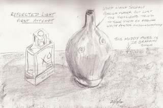
For this exercise to show reflective light, I used 2b pencil, water soluble pencil and 2b graphite sketching stick.
The use of the water soluble pencil clouded the highlights which were totally lost on the vase and side of the perfume bottle. I tried unsuccessfully to save the picture with adding highlights of white pastel pencil.
The table top went wrong looking like a muddy mess of graphite sketching stick. I used a small piece on its side to attempt to shade like I would with charcoal.
I was very disappointed with this as I was happy with the shapes and angles of my objects.


My second attempt was much better, although I'm still not entirely happy with the out come. The shadows and reflected light look correct but I had difficultly with the lines and angles of both the vase and the perfume bottle. Maybe I would have done better to leave this project until another day.
The lesson has taught me to be more careful with the media used and test the techniques before using them on the main piece of work. I intend to have in future have a small test sheet close to hand, and to have little more patience with myself.
Sunday, 28 November 2010

Drawing and painting for pleasure

 Although I enjoy working at my own pace from home, I do feel that sometimes its nice to have feed back from other people. The OCA site is very helpful and the other students are always ready to give advice if asked. Still this does not replace the face to face contact and it can feel lonely at times.


Having looked on the Internet I discovered a local drawing and painting group. They meet once a week and can offer support and encouragement where needed. The group decide on a weekly theme to draw or paint. This was the result of my first week, the theme being white china. Pieces were placed in a central table for everyone to work on their master pieces. Half way through and tea time, everyone looks at others work. No one else worked in the same way as I did, as the display as a whole did not appeal to me, I separated individual pieces and drew three pictures. This was quite a shock to others who had not considered doing that.
Not everyone choose to draw the theme and some worked from their own pieces or from pictures. One person used soft pastels and seemed to enjoy explaining to me how to use them and make the most of the medium. Two others used acrylic paints, one or two used coloured pencils but most watercolours.

It was a most enjoyable evening with some really friendly people, so I'm looking forward to next week when I will be taking my pencils and charcoal with me.

What a lovely way to meet new people, fill a sketch book and gain valuable practice to help my studies.

Monday, 22 November 2010

Odilon Redon


Research Point - Nineteenth-century French artist Odilon Redon and his work.


Odilon Redon (1840 - 1916)

Bertrand-Jean was born in Bordeaux on 20th April 1840 and later gained his nickname, Odilon, from his mother. He studied architecture as his father wished but failed his exams.
Odilon's younger brother became and accomplished architecture, whilst Odilon once again took to watercolours. He became a ysymbolist painter and printmaker. He died at the age of 76 on 6th July in Paris.

There is some interesting information on the following web sites:


Odilon has an interesting imagination, which shows in his work. There was so little that I could pick in the way of examples of paintings that I liked, as although he may well be a very talented artist, I personally don't like the style in which he paints. A lot of his work included spiders with human heads in strange forms, like the picture to the left.


Credit: Oannes, c.1910 (oil on canvas), Redon, Odilon (1840-1916) / Rijksmuseum Kroller-Muller, Otterlo, Netherlands  / The Bridgeman Art Library

The following drawing was one that I like very much. It has an almost child like form about it with the butterflies looking like they have been placed there for no apparent reason. The bright colours used were typical of this artist.

Battle of the Centaurs (pen & black ink and pencil on paper)


"I have often, as an exercise and as a sustenance, painted before an object down to the smallest accidents of its visual appearance; but the day left me sad and with an unsatiated thirst. The next day I let the other source run, that of imagination, through the recollection of the forms and I was then reassured and appeased." (From wikipedia)

Saturday, 20 November 2010

Water Soluble Pencil


After reading on the formus on OCA site not to use hairspray to fix drawings, I dicided it was a good time to visit the craft shop. While I was purchasing some fixative I also found some water soluble pencils that I have wanted to try for some time. Here is my first attempt with them, which I'm pleased with. It was a very quick sketch then a lick with a damp paint brush while the dinner was cooking!

Tone and Form

For this Tone and Form exercise I showed observation's of shadow and light formations on the surface of two candles. My light source was a very strong daylight lamp, which did not allow any reflective light on the opposite side of the light source and strongest highlights.

2b pencil on A4 sketch paper

Tonal Studies

For the Tonal Studies I wanted to try different media to compare the outcome.

My preferred media is pencil and I love the control of a 2b which enables very soft shading to hard cross hatch lines.

Charcoal worked well so long as I could resist the temptation of smudging it with my finger, although the lines are a little thick and would suit a larger sketch.

Pen gives a dramatic effect with deep dark lines to produce very heavy shades. I did find this difficult to show the lighter shades next to the highlighted arrears.

Water colour pencil was the hardest for me to use as it not so easy to see any hatching lines unless they are wide apart. I found myself try to press like I would my 2b pencil to attempt to make the colour deeper in the shadows with little or no effect. May be the pencil was sharp enough for this study.

Carrot - 2b pencil and coloured pencil
Stapler - charcoal pencil
Mug - 2b pencil
Spoon - No 5 drawing pen


At first I found I was temped to graduate the shade from the highlighted side of the light source to the dark heavy shading on the opposite side. It was only when I studied the objects for a while, that I started to see all of the reflective light on the surfaces. The spoon not only had lines of light running down the handle but it also bounced light into the wooden worktop, way in front of the handle. The scanned picture does not show this to the full effect as drawn. I found this fascination the way two shadows were appearing when I was careful to have my lamp at the same angle as the natural light coming from the window.  I spent more time studying the objects, shadows and highlights than I did drawing them.


Wednesday, 17 November 2010

Supermarket Shop

For this exercise I took items from my kitchen cupboard. I first drew them in pencil and added colour pencil.

I am happy with the overall out come but could make many improvements.

It was difficult getting the correct shades with the coloured pencils I own and will now be looking to expand my range. I did use some water colour pencil in an attempt to get more shades.

I had problems making the objects look grounded. Shading the background helped.


The proportions in the drawing seem correct. The size and shape of the objects also look correct in relation to each other.

The overall distance beween the objects seems to be in correct proportions.

Better shading would have given a more solid look to the packaging which I did'nt find easy with coloured pencils.

I did feel I created a feeling of depth in my drawing although improvements could have been made. For example, drawing a background would added something to the image along with shadows from the objects.