Monday 17 September 2012

Essential elements

6 different poses lasting 10 minutes each. 
1. sitting charcoal pencil
My model was not very relaxed which made me uncomfortable. He was tense which showed in his body and I found it very hard to draw him.The first attempt was in charcoal pencil with him perched on the edge of the bed. The balance I caught quite well but due to the speed of the drawing, I could not get the proportions right on the legs and arms.
2. sitting pencil
The second try in pencil did not work at all the proportions are all wrong the near leg is too short and his hand is in mid air with his head resting on nothing.
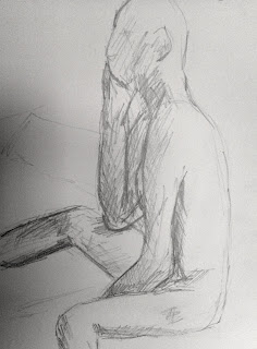
3. kneeling pencil
The third pencil drawing gave a three dimensional shape with the shading but still the proportions are incorrect the torso is central and the limbs seem to be attached wrongly.
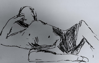
4. laying pen
The pen drawings have a different quality to them but still the proportions were all wrong. The speed drawing did not give me time to correct the drawing.
5. sitting pen
The shoulders were too wide and the elbow too pointed. Another disappointing piece.
6. laying charcoal
Lastly, the charcoal half body laying down. The marks of charcoal on the paper give an impression of shade which in turn adds a quality to the overall drawing. Shading rather than outer lines pleased me in this quick piece.

Pastel Workshops


I am really loving using pastels and have attended a few workshop days.
The results are above, some working form artists peaces and some form photos.
|Love them all as they all have different qualities to them. 

Wednesday 4 July 2012

Research Point-Structure

There is a vast amount of anatomy drawings available on the Internet it was difficult to know where to start, so firstly I looked at probably the most famous in examining the anatomy, Leonard Di Vinchi and looked at the following notebook pages. 


Leonardo Da Vinci
Study of the shoulder 
Leonardo Da Vinci anatomy drawings
Study of arms and shoulders

I felt overwhelmed with the vast amount of information so I turned to my bookshelf.   Although the Internet is a very useful tool I do love to hold a book in my hand. The Figure Drawing Workbook and Figure Drawing and Anatomy for the Artist both by John Raynes are very useful reference books. They give examples of all aspects of figure drawing and a range of media. A better book which I own is The Complete Fundamentals of Drawing by Barrington Barber. This is a book of the basics to more detailed and useful sketching. This inspired me to draw the following of my own examples of anatomy of the human body:


Now back look for more examples of anatomical drawing.
1871_3.jpg
Albrecht Dürer, Nude Woman with a Staff, 1498
Three Studies for the Christ Child
 Marchigian, 1483–1520


Vesalius's muscle man
Muscle man-front view
Andreas Vesalius (1514-64)

Muscle man, c.54.k.12, pg.197
Muscle man-back viewAndreas Vesalius (1514-64)


Friday 9 March 2012

Exercise: Essential Shapes


Drawing 1.  
The requirement for this exercise was to arrange a model in a chair at a slight angle in a chair and consider the axis that runs through the seated figure.
My first hurdle, my model has a bad back and could not twist the way I wanted him to, the second was not liking the charcoal and charcoal pencil I used, although I grew to like it a little better after a few attempts of using it. 
Charcoal has never been my first chose of media. All drawing were on A3 cartridge paper.
I was unsure of how this exercise was to be drawn. Was it of the shapes only or as a figure concentrating on the shapes of indevidual parts of the body, looking more like a sketch as the example in the course work.  

Drawing 1.
Tried this with basic shapes then attempted to connect them to make a figure. I didn't like this attempt and the shapes seem all wrong. The drawing shapes did not work for me. I can see the shapes as I'm looking but I cant seem to draw these basic forms and having them look or resemble anything like a person. Further attempts seem much better to me only considering the form of triangles, squares, circles, triangle, sheres and cones. 


Drawing 2.
Drawing 2. 
Still using the above principle but more rounded this drawing is much better giving some shape. The face and head is not right and needs work.
Drawing 3. 
Drawing 3.
The shading worked well here and leaving the face and hands blank allowed me to concentrate on  the torso and limbs. My favourite of all the sketches, although in reflection I need to concentrate on the whole as it looks like I missed the left side of the chair in which he was sitting.


Drawing 4.
Drawing 4.
The shape and form seems to be good but I'm not happy with the overall outcome of this drawing. The legs don't seem to bend in the right place and the shoulders are too high. All seemed to be working well at the time it's only on reflection it's not so good as the rest.
Drawing 5.

I really like this. It worked well with all the shapes and foreshortening.
The shading works for me with hatching rather than smudging the charcoal. 
No head gave me more scope to draw the figure in more detail, although this sketch
was the quickest of all. I like the speed in which it came together, the fast hatching
and the looking at the body as a whole. Instead of jeopardising the quality with speed I think it enhanced it.  
Drawing 6. 


Drawing 6.
Face in Shapes. The last drawing on this page is of a face made from these shapes in a large A2 size of white plain paper in charcoal. I like the outcome of this piece. All the shapes worked well together and the sketch as a whole looks as it should. 


Thursday 8 March 2012

Other Drawings

Life drawing is something I enjoy. I have spent time on a couple of workshops and practised at home. These are a few of the drawings. It seemed like a good time to log them so that I can reflect on any improvements I am making as I go deeper into the course. 


Saturday 3 March 2012

Assignment 3-redone


I have been working on this assignment 3 again bearing in mind my tutors advise. The above pen and ink drawings were to consider a different composition. My original piece incorporated more of the patio down the side of the kitchen and a bench. On reflection I'm not sure if that composition was terrible successful and wanted to try something different. The views from my home are quite restricted and this was the only open door I could sensibly use, so the only thing I could change was the crop of the view. Both seem to work well, although the one on the right which includes the wall and the drain pipe on each side of the picture seems to frame the view. 


Now to try some colour and different paper. To the left is some prep work with acrylic paint as a base coat with soft pastels layered on top. The wall to the side of my house is made of pebble dash. I have been experimenting with textures and paint so wanted to try my new Mineral Textured Gel which I believed could work really well in this piece. I am happy with this outcome and wanted to use this product in my finished assignment. The layering of colour  appeals to me, leaving some of the undercoat showing through.  
The finished piece, again! This is much better. The composition and the colouring works well along with the use of tone and shadow. I love the Mineral Textured Gel used here and hope to be able to find a place for this media again in my work. I have used a sand texture previously with success but this is a lot bolder and needs more courage to use. I like the effect of the pastel colours taken only on the grit of the product giving a contrast to the sand colour under painting. I have tried to be more dramatic with my mark making and shadows. This I feel has worked better than before but possibly could have even more contrast. This is an area I need to work on as I normally favour a low contrast more pastel look to a drawing I have done. This could explain my almost fear of pen and ink with its sharp contrast and non erasable if you make a mistake. Slowly I am beginning to like this kind of drawing and intend to use pen more often as a chosen media. 
To used canvas for this last piece which gives a good texture. I was disappointed with the edging. I used masking tape around the edge which did not stick very well allowing some of the acrylic paint to seep through leaving a jagged edge rather than a clean sharp one. 

Friday 2 March 2012

Assignment 3-Feedback

My results are in for my assignment from my new tutor. I could have done better, although he has said that the report was written bearing in mind that I have embarked on the degree so maybe I do need some strong structured criticism. 
In general my work should be to a higher standard and I need to look a new ways of working with different media in a much more open, expressive and experimental way. 
Firstly I have been asked to send more work than I sent and my sketchbook. I'm very confused as I believed I was doing what was asked of me for the 360 degree studies and the sketchbook walk with 4 drawings in each. My tutor says I could have filled the book with the walk alone, and I concentrated on "irrelevant signage". I'm not sure what that means!
My drawings of cloud formations seem to have  made a good impression, and I have looked at Contables cloud studies as recommended as well as some of Monet's drawings. Although I do like Van Gogh's dramatic sky in the picture below, Wheat Field with Cypress Tress.


Plotting space through composition "is lacking intent and believability" and "looks amateurish." 
Project perspectives, "variable and inconsistent." The course work says to draw vanishing points on my work, and does not say to re draw those that are not correct, only to examine what was drawn. Now I'm questioning myself if I'm missing something that I should be doing or should I be following the guidelines written in the course text?  
Project townscapes. "Looks a little better when drawing without gridding up vanishing points." This could be the best comment so far. 
Study using line. "The pen and ink line drawing looks as though it has some successful parts to it." This also seems positive until a line I don't understand: "You are making a picture here as you did with the plotting of space instead of investigating the view in spatial terms in real sense." Again, what does this mean?
Drawing from statues I believed was my weak point in the exercises. My tutor seems to like this drawing giving the advise that I could have looked from a different angle or view point which could have made some interesting foreshortening images. Something I had not considered and will remember for another time in a similar situation. 
Drawing trees. "The most successful piece in the assignment from what I can see from the images is the larger study of a single tree in inks. This looks like a good drawing; direct, open, made with intent and using a media inventively; THIS IS A DRAWING! You should approach more of your subjects like this." At last something he likes! I will admit I love this drawing even though I don't normally enjoy using ink. 
The group of trees is not as strong I would agree with that comment. "You have tried to make a picture here AGAIN instead of investigating your subject through the act of drawing as you did with the ink version." It seems that my use of light, tone, texture and shadow lets me down. I think I'm getting it now, there is a difference between a drawing and a picture and I was looking at them as the same thing. 

      Drawing:
1.
the act of a person or thing that draws.
2.
a graphic representation by lines of an object or idea, aswith a pencil; a delineation of form without reference to colour.
3.
a sketch, plan, or design, especially one made with pen,pencil, or crayon.
4.
the art or technique of making these.

Picture:
1.
a visual representation of a person, objector scene, as apainting, drawing, photograph, etc.: I carry a picture of mygrandchild in my wallet.
2.
any visible imagehowever produced: pictures reflected in apool of water.
3.
a mental image: a clear picture of how he had looked that day.
4.
a particular image or reality as portrayed in an account ordescription; depiction; version.

Sometimes things are so easy and looking straight at you, you cant see it!
My question now is should my assignment piece be a picture or a drawing?


Assignment piece.
View from a open door.
Not enough prep work and the 2 sheets I sent were very basic in their enquiry. I find this difficult doing prep work knowing what I intended to draw and the media I was going to use.
"The resultant assignment piece is poor. It lacks tonal variation, an understanding of light direction and how light and tone relate to the use of colour. The mark making is almost non existent; the the drawing is very generalised and lacks presence. You have been far too easily satisfied here and overall feel of this piece is somewhat amateurish. It is imperative that you investigate your subjects through the act of drawing. This is an attempt to make a picture and an ill conceived one at that. The qualitative level of this drawing is well below that required at degree level one."  
Seurat and Van Gogh could be beneficial to study tone, mark making and colour.