Sunday 19 February 2012

Drawing Figures. Check and Log

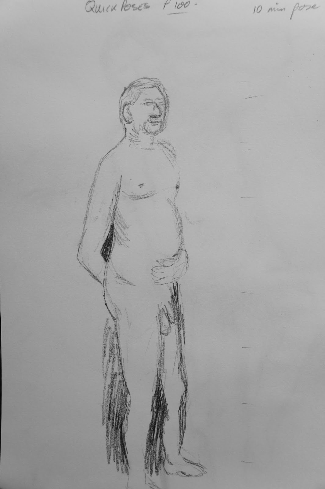
Doing the quick poses were good for me as I like to work quickly without much time to worry about the rights and wrongs of my picture. I enjoy figure drawing and like to work on larger paper when drawing the whole body. The five minute sketches were maybe a little to short but the ten minute poses allowed time to add a little detail with the facial features and muscles. 
Looking back over my last few exercises it is apparent that I have not got the proportions right mainly with the legs and any foreshortening.  
This is an subject I enjoy and want so much to improve and get right. I already own a few books with guidance for anatomy drawing and I intend to make good use of these during this section of the course. Below are practise drawings taken from a magazine, a photo of myself, a quick opportunity to draw my partner whilst he was surfing the net and one of my books. 
I copied a page demonstrating the male and female figure proportions. I found this very useful as it made me look closely at the gender differences and the size of the head and legs. It is much clearer to me now of some of where I have been going wrong. 
Copied from a magazine Gillian Anderson
Copied from pages of Anatomy for Artist by Barrington Barber


Copied from pages of Anatomy for Artist by Barrington Barber 

My partner and myself, a bit of practice

Drawing Figures. Exercise: The Longer Pose

I allowed around an hour for this longer pose. I don't have many voluntaries to use as models and I don't want to only draw my partners masculine figure. I worked from a photograph of myself for this pose. After the initial shock of how big I was and resisting the temptation to draw myself thinner I think it was a good exercise. I used b2 pencil and A3 cartridge paper. 

Drawing Figures. Exercise:Quick Poses


Drawing figures and the quick pose. With my will model I started this section with five two-minute poses. These are in pencil, 2b is always the first one I pick up. Concentrating on the proportions. 
This sketch was in charcoal on A4 paper. It didn't work very well with me getting annoyed with the mess I was making. Back to the pencil. 


These next sketches were ten minute poses. I felt that I was more confident and had time to add some detail making them look human. 

Sunday 12 February 2012

Assignment 3

Assignment 3 finished piece


Colour test for Graphitint, Polycolor and Inktense Pencils
For this Assignment Three, my task was to select a view from a window or open door with a view that includes natural objects, whilst trying to find a view that would allow me to demonstrate my understanding of aerial or linear perspective. The patio door from my lounge was perfect for this with a tree, pots and a path which runs the length of the garden along the fence.
I have never drawn snow and was tempted to wait until the weather had warmed up and all the snow had melted before attempting this piece. Given that my time is limited, I decided to continue. 
My first choice of media is normally soft pastels but I wanted to keep away from the norm and push myself a little. Knowing this section is all about natural object and colours, I purchased some Derwent Graphitint and Rembrandt Polycolor Profi Plus pencils for the assignment. I already owned some Inktense pencils which I have used once or twice and thought they would make a good wash of colour as an under painting to the other pencils drawing in more detail.  I loved experimenting with a mix of colours for the wash and the different shades of my new pencils. 
My preliminary drawings to find a pleasing composition was very useful. I also took a photograph of the view to experiment with cropping to see how the feelings changed in comparison to looking through a view finder.
My first instinct was I believe the best only slightly changing the composition omitting a little of the left hand side bringing the focal point of the large tree to the left of the picture instead of central. The snow had cleared on the lower patio but was still deep down the garden. Looking at my finished piece I wish I had draw snow on the patio to give a more realistic finish. I did change the view slightly leaving out the window along the right hand wall and some empty pots which did nothing for the composition. I added a plant in the pot under the tree as this had perished some weeks ago and changed the colour of the fence and patio to add interest. Looking over my work in this section I can see the difference in my drawings and the vast improvement I have made. I am happy with the final piece even though I can see . places for improvement. 

Sunday 5 February 2012

Project Drawing Trees - Check and log

Looking over the drawings in this section I have drawn 5 different types of trees, some with detail whilst others have been in the background drawn more as a silhouette. 
Each tree has its own shape and bark texture. As this section has been done mid winter, all the trees used had no or very little foliage. 
The lighting was dull and not much shadow was cast. The under side of the branches were in shadow and I shaded this with pencil, used thicker pen marks or a darker colour with the soft pastels.
Some of my simplification was done too much in extreme, as with the pastel drawing. Even though I wanted to give the less defined detail and feeling to show they are in the background I could have afford to give more to the detailing. I also moved trees around from the view to give a more pleasing balance.

Study of Several Trees

I choose to narrow in one one tree with a few small ones behind for this study of a group of trees, A3 pastel paper in a light green and soft pastels and pastel pencils for some of the sharper marks.
I love working with this media but not sure this picture has worked as well as I would have liked. Improvement to the sky and grasses between the trees could be made which would change the overall look completely. The texture and shading on the main tree is acceptable and the tress and bushes in the far distance along the horizon line could have been darker and clearer as looking at it on screen I can now see that the look a bit muddy and unclear. 

Larger Study of an Individual Tree

I may have just got over my phobia of drawing in ink! I'm very happy with the results of this exercise. Using 3 different pens, an italic pen with its different marks at every angle, a fine drawing pen and a thicker marker, and A3 cartridge paper I worked quite fast and loose on this piece. 
It was nice using the italic pen as the slightest movement in my wrist narrowed or widened the pen marks and the speed helped with the fluidness of the branches. 

Individual Tree

This is a tree in my neighbours garden. I'm not sure what it is but I do love the simplicity if the strong looking branches, texture of the light coloured bark  and very little in the way of twigs. 

Drawing Statues

Having never really looked previously for statues I have only just realised how few there are in my local area. I was limited to the time I could spend travelling and nearly gave up after checking out all the grave yards and shopping arrears. I was lucky to discover a solitary wooden statue. Its title is Ancestor and it was curved by Helen Styliandes and commissioned by Lea Valley Regional Park Authority in 1992. It now sits in the historical town of Waltham Abbey. 

In my drawing I used the background to start on the project on trees. I did not like the view so altered the trees to the left of the statue to give a better balance to the picture for which I used an A2 pencil.