Friday 24 June 2011

Project Drawing Animals

Research Point


Looking at Renaissance masters I discovered that not many saw animals as a worthy subject to draw. Albrecht Durer and Leonardo Da Vinci are two of such masters. During this period, most artist believed the drawing of animal form was only used to show the artist talent to show detail.


Durer or Duerer, Albrecht (1471-1528)
The Rhinoceros, 1515 (woodcut)
Albrecht Durer (1471-1528) was one the the first artists to see animals as a worthwhile subject for drawing. The British Museum holds the pen and ink drawing: A Rhinoceros. Durer draw this by copying a sketch by an unknown artist and using some notes. As he had never seen this animal in real life, the anatomy is not totally correct.


Wing of a Blue Roller, 1512 (w/c on vellum with gold)
Durer or Duerer, Albrecht (1471-1528)


Three studies of a bullfinch (w/c & gouache on paper)
Durer or Duerer, Albrecht (1471-1528


Study of a Horse (metal point on paper) (b/w photo)
Vinci, Leonardo da


Study of a dog and a cat, c.1480 (metalpoint on paper)
Vinci, Leonardo da (1452-1519)


Studies of Horses legs (pen and ink on paper)
Vinci, Leonardo da (1452-1519)
Study of Horsemen in Combat, 1503-4 (pen and ink on paper)
Vinci, Leonardo da (1452-1519)


Monkeys, from The Vallardi Album (pen & ink on paper) (b/w photo)
Pisanello, Antonio (1395-1455)


Two horses, from the The Vallardi Album (pen & ink on paper) (b/w photo)
Pisanello, Antonio (1395-1455)
 

Bounding cheetah with a red collar (w/c on parchment)
Pisanello, Antonio (1395-1455)


Exercise: Grabbing the chance
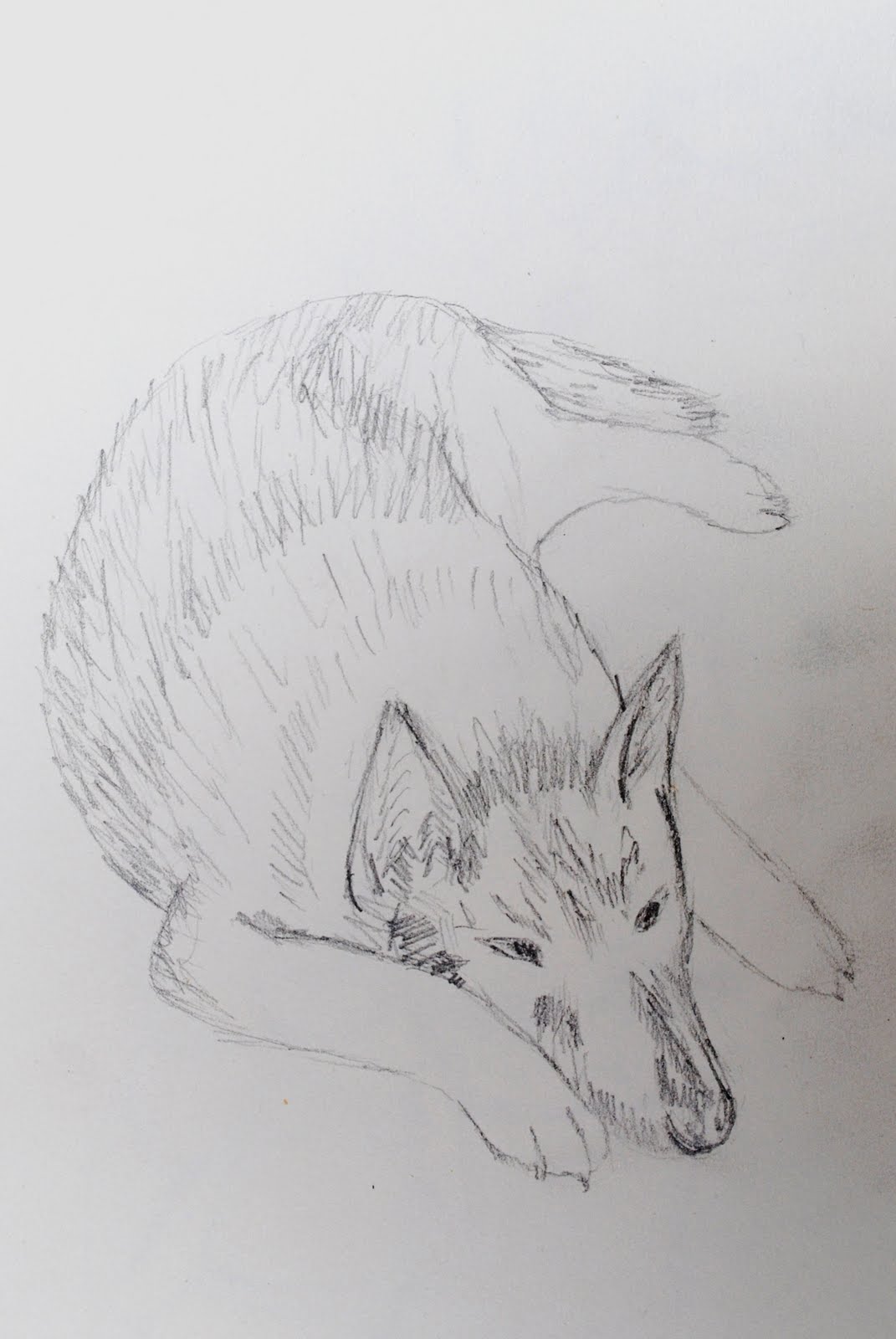

My dog Shadow


My model was not very willing. She kept moving away if I looked at her too long, or jumped on me thinking I was playing. This was challenging for me as drawing animals is not my best subject. 

Saturday 18 June 2011

Drawing Plants and Flowers

Graphite Stick on A3 Cartridge Paper


I was worried about this exercise and was unsure that the end result would resemble my vase of flowers. I needn't have worried and I'm very pleased with the result. Half was through I wished I had chosen an easier flower than mine. I'd like to repeat this with flowers such as sunflowers to see if the results are as good. 


Plants and Flowers in Coloured Pencil


I chose A2 piece of green paper, something I soon regretted finding the colour pencils did not show their true colours on the paper. I did think this would be useful to show the green wall and the colour of the leaves in between the pencil marks. If I were to repeat this I would choose a white or cream paper. Coloured pencils are not my favorite and I much prefer using watercolour pencil both wet and dry on the one piece. I lost a little of the edges due to the paper but found I liked the effect of a black pencil highlighting some, not all, of the edges. 


EXERCISE: DRAWING WITH OTHER MEDIA


For my first picture I used crayon and watercolour pencil. I stated with the crayon to draw the out lines of the leave and petals, then used a white crayon to highlight the white tips of the petals. Watercolour pencils shaded the picture with water to spread the colour.


I liked the resistance of the white crayon which meant I could colour across without having to worry about the light parts being spoilt.


This produced a picture with subtle definition and colours and soft edges. 


For the second drawing I used felt tip pen and soft pastels. The hard lines of the felts encouraged a harder brighter picture with less need for detail. I wanted to use sharp lines to draw the outlines and to add highlights to the leaves and petals. 


Check and Log
This section including drawing negative spaces has shown me how to look more closely at my pictures to ensure a accurate proportionate replica of my chosen still life. 
I needed to keep looking and checking my drawing to the spaces more carefully, watching for any signs of deviation. I kept both mental note and used my pencil held up in front of my still life to line each leaf to the next.
The effect of a three-dimensional drawing, as always, was made using light and dark tones to show shadows. 

Research Point - Ben Nicholson


For this research point I was asked to find out about Ben Nicholson, and why does he simplify still life forms and negative space and superimpose them on the Cornish landscape?

The answer was that he was influenced by Picasso and Alfred Wallis and was said to paint fruit on the window ledge of his Cornish home where he lived with his wife, sculptor, Barbara Hepworth. 


1935

Nicholson, Ben (1894-1982)


1940 (Cornish landscape) (mixed media, oil, pencil & relief on board)
Nicholson, Ben (1894-1982)


1945 (playing cards) (pencil and paint on panel)
Nicholson, Ben (1894-1982)


1950 (cups) (oil & pencil on canvas)
Nicholson, Ben (1894-1982)


Ben was born on 10th April 1982 in Denham Buckinghamshire and moved to London with his family in 1896 where he studied fine art.

His first marriage to Winifred Nicholson lasted 18 years but ending in 1938. He spent some of his married life in Cumberland working mainly on white relief's.

In 1938 he left his first wife and married Barbara Hepworth. He met her, Picasso and Henry Moore whilst in London and Alfred Wallis, who painted the Cornish landscape, when he moved to Cornwall . He incorporated Picasso's cubist style into landscapes as seen from his windows with items displayed on his window ledge.

Ben's transformation into this unique style may never have happened should he have been called into the army. He was unable to serve due to ill health as he suffered from asthma. 


Two Ships and a Steamer Sailing Past a Port, 1931 (oil on thin buff card)
Wallis, Alfred (1855-1942)


Portrait of a Child with Doves, 1943 (oil on canvas)
Picasso, Pablo (1881-1973)

Bottle of Old Marc and Newspaper, 1913 (pencil and pasted paper)
Picasso, Pablo (1881-1973)

Drawing Fruit and Vegetables in Colour

Using Hatching to Create Tone


My first attempt on the left I was unhappy with. The apple and the peach were not the correct shape as I was concentrating on the marks. Overall I felt it was a good practice piece but wanted to do better.


On the right, my second attempt. Must better than the first. The lines are much sharper and the colours better. The hatching shows clearer the shapes of the chosen object and the composition I believe is also better than my first selection.


This was my third exercise using line and tone - Using Markers or Dip Pens. I was happy using felt tip pens which I can use with more confidence giving bold sharp lines. The above Incorporated ink and dip pens. 
This gave me the most enjoyment as I worked. A more simple and pleasant piece I felt. 


Drawing Using Oil Pastel.


I selected a black sheet of A3 paper to show my black and green table cloth which worked well. I am very happy with the lemon which I scrapped some of the colour off to give the effect of the segments. If I were to redo this piece I would not use the slice of papaya. Although I am pleased with how I drew this and that it reflected the true piece of fruit, in the composition it possibly looks more like a piece of fish at first glance. 


Check and Log


I have found with every exercise, my composition and the relating the size to paper is improving, therefore the less the negative space.
What have I learned from drawing fruit and vegetables? I have been more confident with colour, line and tone. This has been the first time I have enjoyed using oil pastels which I believe shows in my work. I was able to use bold colour with a strong application with out hesitation. My mixing of colours has been more experimental as I would have never dreamt of using such contrasts previously. 
Until now I have normally selected media which can easily  be corrected show a mistake be made but in the pen and inks this at first was challenging for me to know that any error would show as a mistake or needed to be worked into the picture.