Saturday, 31 December 2011

Study of Townscape Using Line

Using drawing pen and a thicker Stabilo universal marker, I drew a scene of the town centre from my office building where I work. The main focus was of the middle of the picture using the darker more solid lines. 
The day was dark, cloudy and had been raining. The town which is normally crowded with shoppers was empty other than a handful of people. I sketched a general shape of these bodies, not wanting to give any emphasise on them but of the buildings behind them. The whole picture was dark and very little shadow could be identified. 
Being just before Christmas, the lights were up and hanging from the building across the road. I had to remind myself that I should not be giving much detail to them lights hanging in the foreground and the buildings were the main focus. 
I used a ruler for the larger lines which looked a bit strange so I overdrew freehand to give a lighter feel to the shapes of concrete and stone. For the wooden cladding I used fine lines to show the planks across the front of the middle building which I think worked well. 

Saturday, 24 December 2011

Check and Log

The problems I had with perspective drawing became very clear once I drew the eye level and angle lines on my drawings. After the first exercise, I became more aware of having to be precise with the size and proportions of my sketches. Any slight variance can made a big difference so I need to take more care with this.
My lines are not very straight and my preference is to use a ruler. Although there is merit in drawing lines freehand as they look softer and more natural. The angular perspective is made easier when using a ruler as the lines are easier to see and any corrections can be made quickly or avoided all together. 

Angular Perspective

The exercise asked for me to draw a row of buildings from a corner, so I stood on the pavement of a sharp bend close to my home. 
Once at home I drew my eye level and lines to see how accurate my angles were. I am happy with the lines from the left hand side, which I drew in green pencil. They all seem to meet in the one space as it should directly at my eye level where I was standing. The other side I show with red pencil. These lines are not very good at all. Although I'm not sure which angles I should have been following as the road and buildings seem to curve. 
In reflection, after revisiting the space from where I drew the picture, I am happy with the overall result. The old houses are not in a straight line and bending round a corner. Should I redo this exercise I would select a different corner from which to draw. 

Sunday, 18 December 2011

Parallel Perspective - an interior view

For this exercise I had to select an interior view from room to room to draw and check the vanishing points of my drawing.
I drew from my kitchen to my bathroom as this gave me a range of lines of a door frame, the open door, tiles on the flooring running into the bathroom and tiles on the bathroom wall. 
I could not stand exactly square on as these was another door frame next to me in the way. I did not realise until later how this very slight angle would affect the angel of the vanishing point which I drew in later with red lines. 
No rubbers or rules allowed for this exercise, not as scary as it would have been a few months ago. My lines are not as straight as I would like and need some practice. My eye level was two thirds the way up the door frame and I was standing level with the right hand third section of the doorway.
When checking the lines in comparison of what I was looking at I was quite happy with the results and did not feel that I needed to redraw any parts other than the tile line on the right of the floor to take the vanishing point to my eye level. 

Saturday, 17 December 2011

Check and log

Looking back over the last few exercises I found various techniques useful to create a sense of distance and form in my sketches. 


Until recently I had always looked at drawing/painting and photography in very different ways but now I can see at least one aspect which is similar in the focus and depth. A camera allows a setting to focus on a particular part of the frame giving clarity to the item selected. When drawing or painting, the same principal can be used to give depth to any picture the only difference being the focus would be in the foreground. This foreground needs to be the clearest part of the frame, the middle with not so much detail and the background should show very little detail and a more foggy appearance. The colours are also a helpful tool to show depth. The foreground being bright and rich in colour giving the appearance of clarity, drifting towards the background with a lighter, greyer more pastel shade of blur. This principal can make the eye transfix to the artists selected piece of the frame. 


All preliminary work is useful and should be done before a larger piece of work is attempted. Using a small sketch I discovered that various watercolour pencils from the same tin worked in different ways. Some gave way to the water very easily others kept the line and the pigment needed harder brushwork to move the colour. Without this preliminary work a large amount of time and effort could have been wasted on a large scale drawing. 


It is preferable to simplify most views focusing and giving attention to a single or a selected number of items in the frame. An artistic interpretation gives way to select a part or to remove undesirable pieces from the finished work. 

Plotting Space Through Comporsition and Structure

After selecting a photograph to copy, I took a sheet of A3 cartridge paper coloured pencils and watercolour pencils. I wanted to show the depth in the picture with the different use of this media. 

Drawing Cloud Formations

For this exercise I drew cloud formations trying to highlight the tones using charcoal, conte crayons and a putty rubber.

These media could be shaded or used with hard lines.

I did a small scale drawing which included a sketch of a few buildings in an attempt to feel the whole picture, then added the blue sky with the clouds as a negative. Pale blue shading was added last which gave the tonal shades to the clouds. This was my favourite of all the tested techniques I attempted.


The blue studies in oil pastels were easy to give a varied contrast to but did not give a realistic interpretation of the clouds, although it could be a very useful approach in some situations.


My biggest obstacle with this exercise was that the daylight hours I was able to spend time on these studies the skies were a thick blanket of rain cloud with no variation to the tones what so ever.

Wednesday, 9 November 2011

Research Point - Lorrain and Turner

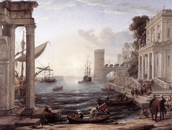
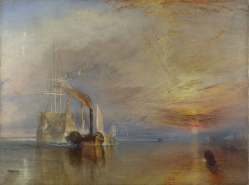
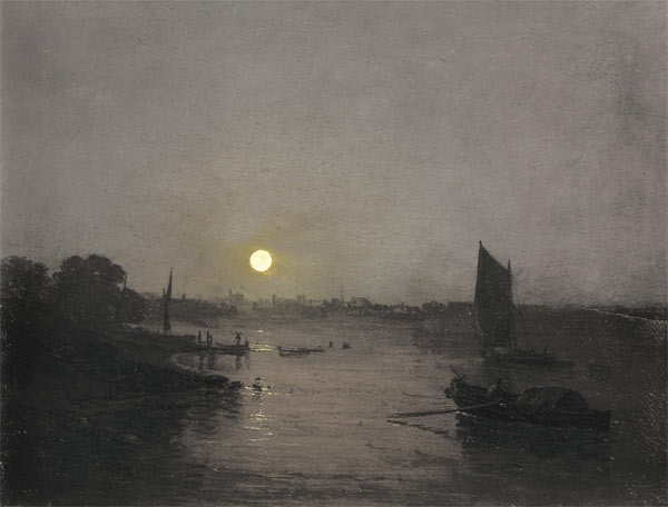
I had to look at the work of Claude Lorrain and Turner. Then write notes on how those artists divide their landscapes into the foreground, middle ground and background.


Lorrain never worked on any other subject other than landscapes. He separated his paintings with very clear areas. The foreground in the above picture looks almost as if it could be a frame made from bold intricate figures, animals, tress, shrubs and pillars. The eye is drawn through this frame work to the middle ground of more tress and a church/building. This section is drawn with less detail and is much lighter in colour. The background in the distance is so faded that it is nearly nonexistent show only a representation of what could be far away.

Simular to the above drawing, this painting has the same typical structure. The people, boat and the few selected items in the foreground have been awarded the most time and detail to give them a bold look. The mid ground of people, buildings and boats a little lighter and the background faded showing very little in detail almost looking unfinished.


Turner separates his landscapes in the same way as Lorrain. The foreground water with great detail, the ship closest to the viewer is the clearest and richest in colour, the mid section still showing some of the detail of the ships and the background a wish wash of muted colours.

In this Turner masterpiece, he has shown more detail in the mid section of ships, the foreground has lesser detail as it is in darkness and the background more light with the moon shinning down on the hazy detail of the ships and land in the distance.

Research Point - Pentimenti

Mistakes in master drawings are known as pentimenti. Drawings are often more valuable if they contain pentimenti. I needed to find out about pentimenti and restatements and find examples of them in famous drawings and log my findings.


The Old Guitarist

Looking for at pentimenti I found quite a few examples of famous artists work which has been over painted to reuse the canvas but very little work showing these mistakes which have been overworked and revealed via x-ray in ghost like images.

I found a good example on Wikipedia of this, The Old Guitarist by Picasso. Although this total over work when the artist has changed his mind about subject it is not commonly known as pentimenti but as a restatement.


De vredesonderhandelingen tussen Claudius Civilis en Cerealis
In this painting by Ferdinand Bol, when he over painted his figures they would have been hidden my the new layer of paint. Over the years these figures have started to show through which is quite common with age. It is very clear that Ferdinand moved the composition around until he was happen with the position of his figures.

Views of Paestum
This picture shows red markings which were the correction. It can safely be assume that Piranesi sketched this in 1778 and intended to use this as preparatory studies for a series of etchings.  

Leonardo Da Vinci
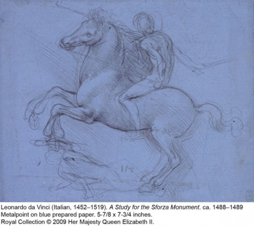
Leonado Da Vinci is famous for his preliminary sketches which more often than not have pentimenti within them.

In all my studies in art, I have been advised not to use a rubber but to leave any mistakes and over work them. Also pentimenti although I'm not yet a famous artist.

Monday, 7 November 2011

360 Degree Studies


I found this lesson very valuable.

The course book said to find a space where the view is unrestricted. Having had a lot of time wasted whilst I was trying to find my mojo again, I wanted to get on with the course. Time was short this week so I took a long lunch from my office desk and drew the local market square.


I did not know if this would work believing that I would be drawing market stalls and people in every direction, how wrong was I. 

Looking East there was part of a meat lorry and the wall of the bank. North as I regionally expected every area to show was a market stall selling food but a graveyard behind. South overlooked the bandstand, the market shed, a caged area with a folded trolley on top and stalls in the distance. West was dominated by a single stall with two customers stopped and looking at the goods. I even managed to capture a person walking past with a very quick sketch. 


Every inch of every view showed a different thing to draw either in the foreground or the background. I found myself looking at the buildings behind the market and the details in their architecture I had never taken any notice of before. 


A Sketchbook Walk


For my sketchbook walk I visited my local park. 


The top sketch is an area which separates the open gardens and the animal petting area. With the sun sinning from the left the shadows were quite deep on the right hand side of the wall through the centre of the page. What attracted me to draw this area was the way the watering can was rested at an angle and the reflections on the dogs drinking bowl from the tap above. I worked only a few feet from the edge of the wall.


The next picture is of the closed cafe about 30 to 40 feet away from me. It was quite dark and mostly in the shade. I do think I could have been a little more generous with my pencil to show this darkness.

The first  the sketch is of a pathway over a small bridge the day was overcast and being near a large will tree everything was dark. The dense shrubbery looked easy to draw until I started trying to capture the details. The foreground was very close and in shadow. The mid section was in good light and the background dark again. I took the longest time over this picture only stopping after about 20 minutes or maybe a bit longer. 

The last sketch looking over the pond with some rocks in the center. Shaded areas all over due to the large trees. 

Landscape Drawing - Research Point - Looking at Artists

Looking at and researching different artists showed many styles to depict the landscape. The course material recommended that artists such as Durer, Lorrain and Lowry's works were used as examples.
Albrecht Durer (1471-1528) The Pond in The Woods (1496)
http://en.wikipedia.org/wiki/File:Albrecht_D%C3%BCrer_-_Pond_in_the_Woods_-_WGA07358.jpg

Durer was one of the first artists to realise the potential of watercolour paints. A German painter, possibly one of the greatest artists of Northern Renaissance.

In the above painting, The Pond in The Woods, Durer has shown explicit detail on the grass in the foreground. Other areas are left looking unfurnished. He creates a depth to the water by using the changes to the colour from a deep blue to a brown.

Laurence Stephen Lowry (1887-1976) http://menmedia.co.uk/manchestereveningnews
Industrial Landscape (1958)
Famous for his simplistic stylisation of poeple Lowry painted the working class within an urban landscape. Great care was used in the architectural detail but very little to show any weather conditions such as cloud or sun. This does however allow him to show the smog in his "Indrustrial Landscape" above which sold for £602,400 in June 2007.  
Evening Calm a limited edition print by Gerald Coulson
Gerald Coulson http://www.buy-fineart.com/
Evening Calm 
Gerald Coulson is an Emglish self taught artist who has been producing pieses of work for over 30 years. He is known for his milarty aircraft pictures with moody backgrounds and colourful skies. I was drawn to this piece of art due to the stillness and as the title the calm warm colour of the yellow sun.

David Hockney (1937) http://www.hockneypictures.com/
A Bigger Grand Canyon
Another English landscape artist. He is currently living in USA and working in a huge workshop which suits his very large scale pieces of art. The Royal Academy of Art hang Hockney's largest painting 'Bigger Trees Near Water' which measures 15 x 40 feet. All his work is big bold and bright.

Sunday, 6 November 2011

Fauves


Above is my finished piece from a one day pastel workshop-painting the fauves. We looked at work of Matisse and Durain to name just two. Then the class used photos of landscapes to produce their own landscape in a modern version in this fauvism style. 
All in all a very successful day and very enjoyable. It showed me not to shy away from the use of bright almost luminous colours and that sometimes accurate straight lines are not always necessary to produce a good work of art. 

Goya


Goya:Drawings from his private albums I was recommended by my tutor. The book consists of sketchbook drawings mainly in pen and ink. His use of shadow and strong contrast is why my tutor was getting me to look at I'm sure. I was impressed by the use of strong bold lines and shadows and like the loose feel to the sketches. 

The album is full of either drawings of people of animals. Some even combine the two having a human body with a head of a donkey. 

I wanted to try this deep drawing style for myself and show here my version of Goya's The Butterfly Bull and an extracted piece of Nightmare. 

Feed Back - Assignment Two

The second tutor report has been delivered some time ago. He says I'm progressing well but I need to work on a few points in order to make steady improvement that is needed to prepare for assessment.
My tutor was happy with the varied media and mark making used but is concerned about how I show the light direction, shadow, reflection, definition between objects and three-dimensional depth. Comments were also made about my use of black to edge my vegetables in one of my still lives and on the pan in another which can kill form which made it loose its roundness. 
My pencil drawing of the flowers and the lamp he says is one of my better drawings as the line definition is clearer and shows more evidence of light direction and surface light on objects. Attention is still needed on the immediate shadow under the objects and he would like to see a much stronger and variable colour in the leaves. 
It was noted that I have very little in the way of animals in my log book and that I obviously struggle with this subject. 


Suggested Reading:
Goya:Drawings from his private albums by Juliet Wilson-Bareau
Cezanne:A Cezanne Sketchbook:figures, portraits, landscapes and still lives


Both books I have now purchased and given the report, I can see why he recommended this books for me. 


Pointers for the next assignment:


1. More awareness of light direction, immediate shadow under objects, cast shadow, light on     surface.
2. More contrast between light and dark.
3. Definition of line but not too thick lines.
4. Spatial depth.
5. Controlling the use of black.


I emailed my tutor for advice about the next section of landscape work as I do not feel at ease with this subject. He suggested that I join a group of local people either via OCA web site, a local self run group or to pay for tutoring in a similar group.


I joined a local college for a one evening a week life drawing course, booked 3 one day pastel monthly workshops, and joined Hertford Art Society. All far too much I now realise along with a full time job, drawing and painting and a photography course with OCA. I found I had taken on so much I couldn't cope and lost my inclination to pick up a pencil. 
My photography course is on hold until I finish the drawing one course so that I can concentrate on one subject at a time and I've dropped the life drawing at college. I going to continue attending one evening a week the Hertford Art Society. This is very relaxed and I can attend as many weeks as I wish. Every other week is a practical drawing or painting untutored session and the other weeks are critiques, talks or demonstrations.
Having spoken to OCA about my various problems it was suggested by them that I change tutors which I have now done. 
I contacted my new tutor and had the pep talk and now have the pencil securely in my grasp. He seems to be the inspiration I needed to get me back on track. 

Thursday, 28 July 2011

Assignment Two

Looking through the last few exercises I felt that I wanted to use oil pastels for my final piece in this section and looked for a new still life which would help to demonstrate the following:
1.   an understanding of the use of colour
2. an understanding of the most appropriate choice of medium for the subject and skill in using it
3. the ability to set an interesting composition
4. variety in mark-making, depth, contrast and tone
5. accuracy and a demonstrable understanding of form


The following sketches and colour experiments helped to make a final selection for my final piece. 


Final piece for assignment two. Still life in oil pastel on A2 pastel paper.
I am very pleased with the end result. The composition works well for me, the colours and shapes mirror each other and seem to work.
If there was one thing I would change, it would be the angle in which I sat to enable the horizontal line of the table to the wall to be straight across the page rather than being at an angle. 

Wednesday, 27 July 2011

Check and Log

The main challenges I faced with drawing animals is keeping them still. I didn't find it easy to draw fur or my dogs expression and every time I looked a her she thought I wanted to play and jumped at me. Even in my garden, no birds or cats seemed to visit at a time I wanted them to.


Should I not work full time, I would have been able to look further a field to find suitable animals to draw and would have explored local parks and rivers for ducks and dogs being walked, or a zoo for the more exotic animal and maybe to odd insect of two. 


Oil pastels seemed to work well to draw horses and fish. This media gave a shiny effect on the scales and the horses coat. Soft pastels made a good feather, edged with pen and ink to give detail on the wings, eye and feet. My greatest discovery is Neocolour II, water soluble oil pastel. I don't yet own any but have tested them at Art in Action exhibition in Oxford. Their use is so versatile and they give a vibrant paint or crayon effect depending how they are used. Wonderful for an abstract, probably not the best media for realistic portrait of any animal. 

Art in Action 2011

 I took a couple of days off work to visit Oxford for the Art In Action four days in July. I booked various practical classes and gained so much from the whole experience. 
Soft Pastels
I took this practical class as I thought I may learn
how to use this medium better than I had been. 

Neocolour II - Caran D'Ache
I found medium which is new to me. Artist Robin Gray was demonstrating these
water soluble oil pastels which you colour have a free trail. This is the result of my first
abstract fish. I do love the rich colours and the versatility of these crayons. Use them dry and add water or use them as a paint pallet, or just dry....fantastic!
They are now on my Christmas list. 

Paint on Silk
Another practical class which was fairly successful. I love the effect of rock salt left to marble the wet paint.
I may use this as an image for birthday cards.

Batik
I'm not so happy with the results of this practical class, although I'm sure I have learnt from the experience.
  
Print making - my first attempts
Not the best framing which was wet when placed in to a plastic sleeve and smudged. 
A special thank you to the OCA stand in the exhibitors market where I met Dee and Stephen. They were very helpful and gave met some great advice on my drawing course with OCA.


Wednesday, 20 July 2011

Research Point - George Stubbs

George Stubbs was the son of a currier and leather merchanta, a self taught artist born in Liverpool in 1724, moving to London in 1759.

He was one of the first artists of his time to consider animals as a worthy subject to draw and was most famous for his drawings of horses, although he was known to draw other animals including lions, tigers, giraffes, monkeys, and rhinoceroses.

With the help of his common-law wife Mary Spencer, George dissected horses on a table in his rented farmhouse. He lived in this farmhouse for 18 months in the years of 1756 and 57. In 1966 he published The anatomy of the Horse, which would have not been possible in that day and age without such dissection. The origional drawings are on display in the Royal Academy.  

The Study of Muscles: Ecorche Drawing Seen from the Flank, from the 13th Anatomical Table, from the...
Stubbs, George (1724-1806)

The Study of Muscles: Frontal and Rear Views, from the 13th Anatomical Table, from the "Anatomy of...
Stubbs, George (1724-1806)

Mares and Foals Beneath Large Oak Trees, c.1764-68 (oil on canvas)
Stubbs, George (1724-1806)

George was known to first draw his subject, the horses, then draw a suitable background in some of his pictures.
"Whistlejacket" and two other Stallions with Simon Cobb, the Groom, 1762 (oil on canvas)
Stubbs, George (1724-1806)


Friday, 24 June 2011

Project Drawing Animals

Research Point


Looking at Renaissance masters I discovered that not many saw animals as a worthy subject to draw. Albrecht Durer and Leonardo Da Vinci are two of such masters. During this period, most artist believed the drawing of animal form was only used to show the artist talent to show detail.


Durer or Duerer, Albrecht (1471-1528)
The Rhinoceros, 1515 (woodcut)
Albrecht Durer (1471-1528) was one the the first artists to see animals as a worthwhile subject for drawing. The British Museum holds the pen and ink drawing: A Rhinoceros. Durer draw this by copying a sketch by an unknown artist and using some notes. As he had never seen this animal in real life, the anatomy is not totally correct.


Wing of a Blue Roller, 1512 (w/c on vellum with gold)
Durer or Duerer, Albrecht (1471-1528)


Three studies of a bullfinch (w/c & gouache on paper)
Durer or Duerer, Albrecht (1471-1528


Study of a Horse (metal point on paper) (b/w photo)
Vinci, Leonardo da


Study of a dog and a cat, c.1480 (metalpoint on paper)
Vinci, Leonardo da (1452-1519)


Studies of Horses legs (pen and ink on paper)
Vinci, Leonardo da (1452-1519)
Study of Horsemen in Combat, 1503-4 (pen and ink on paper)
Vinci, Leonardo da (1452-1519)


Monkeys, from The Vallardi Album (pen & ink on paper) (b/w photo)
Pisanello, Antonio (1395-1455)


Two horses, from the The Vallardi Album (pen & ink on paper) (b/w photo)
Pisanello, Antonio (1395-1455)
 

Bounding cheetah with a red collar (w/c on parchment)
Pisanello, Antonio (1395-1455)


Exercise: Grabbing the chance


My dog Shadow


My model was not very willing. She kept moving away if I looked at her too long, or jumped on me thinking I was playing. This was challenging for me as drawing animals is not my best subject.